KOREAN FONT 한글 폰트
Font is written as "폰트" in Korean (Hangul). Pronounciation-wise, imported foreign word "폰트" is following its original English sound. However, Korean-ized pronounciation is "pont", due to no existence of "f" sound in Korean language.
FREE KOREAN FONT DOWNLOAD WEBSITE
Thankfully, big wales like Google and Adobe provide free Korean fonts which might be quite accessible for English speakers. Google Fonts, especially, delivers modern & popular free Korean fonts which has been released domestically from big Korean companies. On top of that, Adobe Fonts are available only in Adobe softwares. If you have an paid account in them, about 105 quality Korean font families are ready to come to your hand.
In addition, several font webservices also distribute Korean fonts. Among them, a website called "Free Korean Fonts" visualizes 103 free Korean fonts in its own platform providing links to connect you and its original download page. This website might one of easies browser to see as many accessible free Korean fonts as possible. In my opinion, this website appears to carry familiar font sets too, which have been embeded in Korean softwares and Microsoft documents.
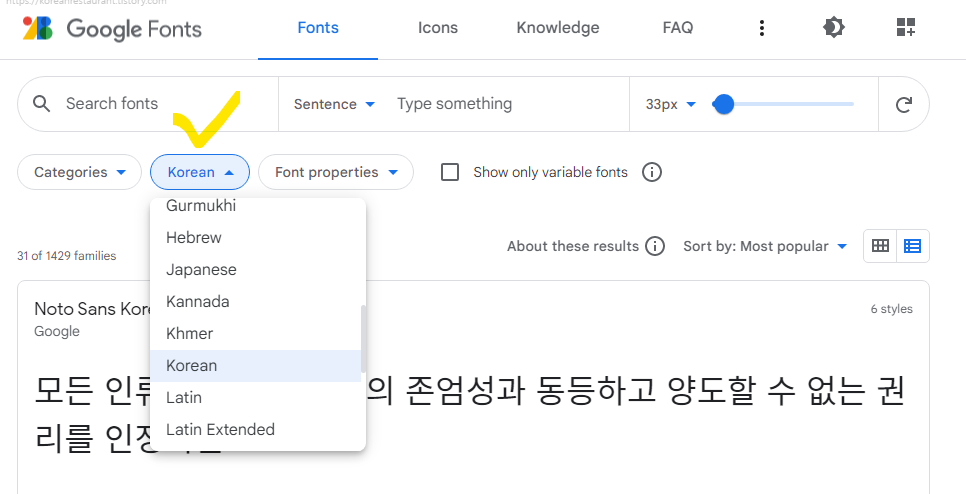
Google Fonts (ko)
≫ 31 font families
≫ THE MOST TRENDY
≫ Applicapable for web design
≫ Website : https://fonts.google.com/?subset=korean
Adobe Fonts (ko)
≫ 105 font families
≫ Only for Adobe software users
≫ Providing similar but variable quality fonts
≫ Good for detail-sensitive designers
≫ Website : https://fonts.adobe.com/fonts?browse_mode=default&languages=ko

Free Korean Fonts
≫ 103 unicode free Korean (Hangul) fonts collection
≫ Providing links for original download page
≫ Website: https://www.freekoreanfont.com

WHAT FONTS DO KOREANS USE?
MAYBE OUT-DATED
Before we talk about what fonts do Koreans use, I want to mention which fonts seem outdated in Korean’s eyes - This might be my subjective opinion !
굴림 Gulim
굴림 Gulim (or 굴림체 Gulimche) is one of old style fonts that you may not want to use for nice-looking design stuffs. That doesn't mean Gulim font is aethetically coarse, it is just out-dated style. Also old fonts were designed for low resolution display. Old official papers published in 60~80's seems to use this. If you used this, native Koreans could guess no other Korean fonts were obtainable in your side.

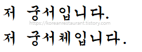
궁서 Gungsuh
I saw Gungsuh font is introduced as a calligraphic Korean font at some websites... Yes it used to be cool calligraphic font A CENTURY AGO! Nowadays, Koreans made a joke with this font. “I’m in Gunhsuh font” means “I’m super serious”. If I may, I would like to recommend not to use this font for picket, placard, sign or cool graphic shirts design, because these are supposed to be friendly. I’m in Gungsuh font now 😌
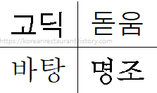
ANCESTORS of ALL-TIME BASIC
Even though the released time is similar to formerly introduced two fonts, some font sets are still polular and widely loved. Four old font families named "Gothic(고딕)", "Dotum(돋움)", "Batang(바탕)", "Meyongjo(명조)" has generated more sons and grand sons in font history as time goes by. To categorize them with comparison to English fonts, "Gothic(고딕)" and "Dotum(돋움)" reflect "Sans-Serif" style feeling, whereas "Batang" and "Myeongjo" is close to "Serif".
From by themselves to descendants of them, those four styles are commonly used in Korea throughout decades. For instance, "Malgun-gothic(맑은고딕)" used to be an absolute "default" font which was embeded in "Hangul" software - Koreans use "Hangul" the most for document writing instead of "Microsoft Word". In recent "Hangul" software, "Hamchorong Batang(함초롱 바탕)" is set as default font.
MAYBE UP-TO-DATE : GOOGLE FONTS
More options could confuse you more. Google fonts delivers selected 31 popular Korean font families for free. Almost all of them are offered by big Korean companies such as Naver, Woowahan Brothers, YoonDesign Inc and so on.
Naver, for example, is a dominent search portal domestically. In a span of one year from July, 2022, Naver occupied about 58.58% web searching market while Google Korea made 30.92% proportion[Internet Trend]. Beside, they have released free font series over decade. This means Korean people are familiar with "Naver" font sets in their daily life. Their fonts are well-known as "Nanum" series.
Similarily, Woowahan Brothers has been hot as a unicon company, leading "delivery food" industry in Korea. "Baedaleui Minjok(배달의 민족)" is their app Koreans use quite often. This corperation also released unique bold font sets. Nowadays, their fonts, particularly Do Hyeon, Jua and Yeon Sung are often witnessed in various commercial services due to its conspicuous character and license-free policy I guess.
On the other hand, YoonDesign Inc has released free/paid Korean font sets welcomed in publication industry. "Yoon Gothic", "Yoon Myeongjo" font families are famous especially. YoonDesign font sets are often seen in official reports, government documents and institutional font guidlines.
POPULAR KOREAN FONTS BY STYLE
Free Korean fonts available on Google Fonts is going to be sorted by its style in this part. Instead of sorting all out, I chose good-looking fonts based on design experiences, and categorized them. You could go to Google Fonts website and have a full look by yourself also.
BASIC
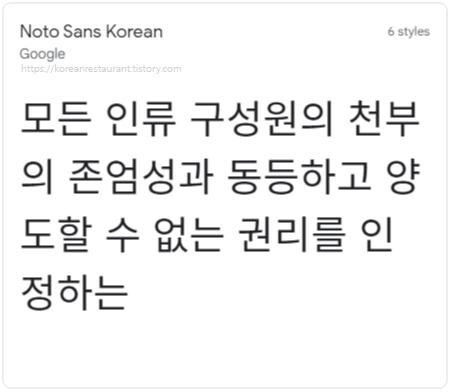
Noto Sans
Noto Sans is Sans Serif style Korean font created and released by Google. Suitable for default Korean font family as all-around style. All-around, basic, versatile including body text.
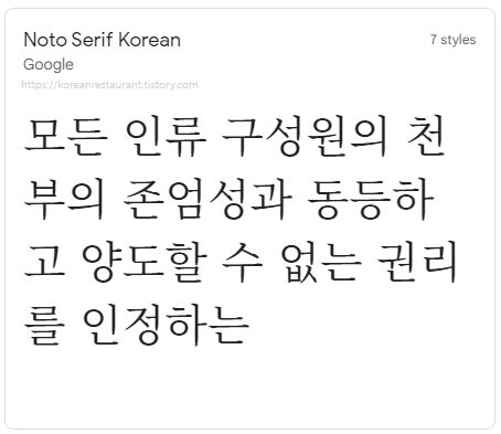
Noto Serif
Noto Serif is Serif style Korean font, also created and released by Google. Suitable for any spots which require all-around serif style Korean font. All-around, basic, versatile including body text.
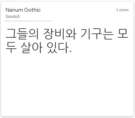
Nanum Gothic 나눔 고딕
Nanum Gothic has been created and released by Naver(Sandoll). This is main font Naver search portal applies. Clear stroke increases legibility, while rounded corner of edges made delicate and friendly feeling. When this font was first released to the public, Korean digital typography appeared to step onto the next level in my mind. With this font, the Korean text on your document or in your design would be fine pretty much! All-around, basic, versatile including body text purpose.
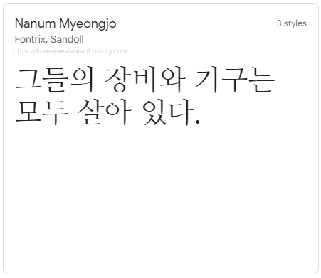
Nanum Myeongjo 나눔 명조
Nanum Myeongjo is also one of "Nanum" font series created and released by Naver(Sandoll, Fontrix). This is contemporary Myeongjo(serif) style Korean font. Anywhere you wan to use neaty "serif" style Korean font can go with this. All-around, basic, versatile including body text purpose.
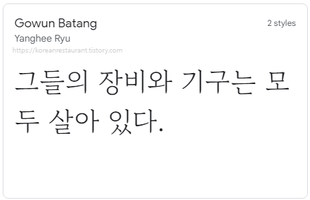
Gowun Batang 고운 바탕
Gowun font series is designed by a female designer Yanghee Ryu. Each stroke in Gowun font series is delicately designed. Both end of each stroke is smoothly thickend, which enhance clearness of letter. Gowun Batang is one of Serif style font family developed from the basic font "Batang", and you might want to use this when warm atmosphere is hoped to be added in clean and clear text contents. All-around, basic, versatile including body text usage.
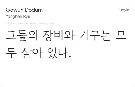
Gowun Dodum(Dotum) 고운 돋움
Like aformentioned, Gowun font series is designed by a female designer Yanghee Ryu. Each stroke in Gowun font series is delicately designed. Both end of each stroke is smoothly thickend, which enhance clearness of letter. Gowun Dodum(or Dotum) is one of Sans Serif style font family developed from the basic font "Dotum", and you might want to use this when clean and clear text contents delivery is prefered. All-around, basic, versatile including body text usage.
HANDWRITING / LETTERING
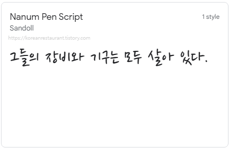
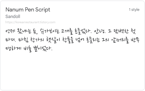
Nanum Pen Script
I'm glad for introducing Nanum Pen Script, one of my go-to fonts. Truly "handwritten" feeling is shining through. This font looks good in digital design too. Unless you are looking for “feminine” style handwritten fonts, this one would be decent. Actually, Nanum Pen Script has a brother called Nanum Brush Script. It will be introduced in “Calligraphic” section. If you are to use one of Nanum Script fonts, try both pen/brush font sets and see which one fit better to your prefered font size and length of text.
While writting about Korean fonts, recent extensions of “Nanum” series were found. It contains developed handwritten style font sets using AI technology. In other words, AI created font sets by analysing Korean people’s real hand writting materials instead of designing. It would satisfy “Korean handwritten fonts” googlers. Nanum handwritten style font series will be discussed in different article seperately.
CUTE
HAND WRITING / LETTERING STYLE
Hi Melody
Hi Melody handwritten style font looks younger than Nanum Pen Script. To compare this with Gamja Flower shown below, Hi Melody appears more humane. I guess this feeling comes from rounded corners which naturally occures in real handwriting. In my eyes, Hi Melody feels like a “young” and “gender-neutral” handwritten font.


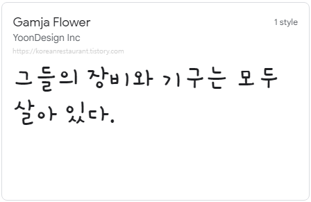
Gamja Flower
As I mentioned above, Gamja Flower is similar to Hi Melody, both look “young” and “gender-neutral”. Beside, Gamja Flower has thicker lines and angular corners, these increase clearness especially when fonts are small and seen from far distance away.
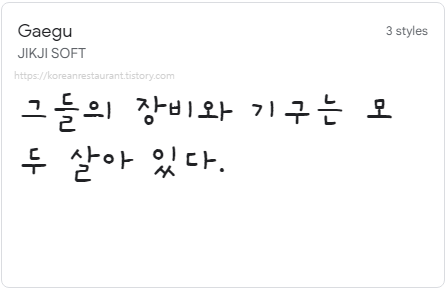
Gaegu
Intended slight dislocations of each alphabet is charm of Gaegu font. Gaegu(개구) means “mischievous” or “naughty”. Atmosphere of this font is like young naughty children’s. This might be perfect font style for children’s book.
Cute Font
Font name itself is “Cute”. I have seen some middle school girls write this way. To illustrate more, Cute font and the following Dongle font, both of them put bottom consonant below an invisible guide line. Comparatively, text flow in Cute font is a little more rythmical as if it’s done by hand.

CUTE
DIGITAL PRINTING STYLE
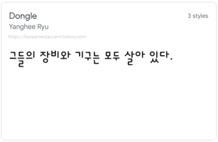
Dongle
Like mentioned above, Dongle font also put bottom consonant below invisible guide line. I saw some middle school girls like to write this way. One difference here is text in Dongle font stick to an even top line, which apply a feeling of computer typing.
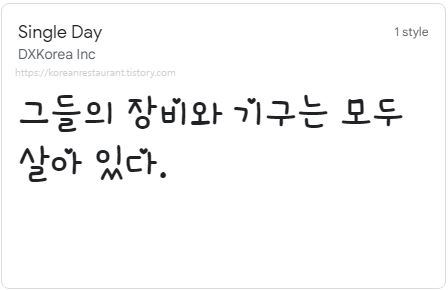
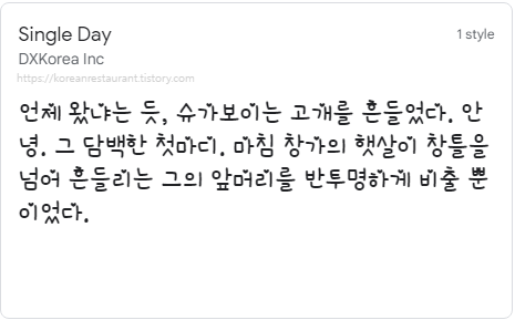
Single Day
Love letter style font. Yes. girlish too. Cute? Why not. Handwritten feeling with heart marks together. Express your lovely phrases with this font.
CALLIGRAPHIC
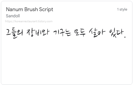
Nanum Brush Script
A brother of Nanum Pen Script. The two fonts are same in written shape, except for stroke style. Stroke of Nanum Brush Script is, as its name says, designed as brush touches, while that of Nanum Pen Script keeps consistant width like pen drawing. If you are to use one of Nanum Script fonts, try both pen/brush font sets and see which one fit better to your prefered font size and length of text.
Dokdo 독도
I feel protesters’ spirit from Dokdo calligraphic font. Dokdo is an name of Korean island formed by volcano rocks. With this, Dokdo font sets seemed to designed reflecting the rocky island appearance. If I am allowed to mention gender, this one might be manly character sets. Looking good for big title, slogan.

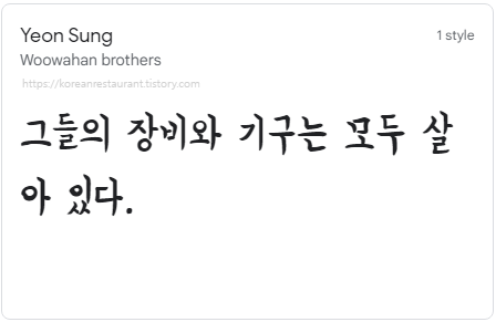
Yeon Sung
Yeon Sung font released by Woowahan brothers might be intended to represent water-ink pen feeling. This one reminds me autobiographical essay books personally, on the other hand, some funny meme makers use this font in social media.
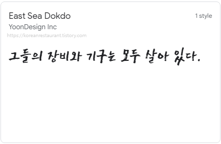
East Sea Dokdo
East Sea Dokdo illustrates rough and powerful brush touches. Straight lines, dry brush marks arouses intensity. Looks good for short phrases.
Black And White Picture
Woodprint style font sets. Recommended only when you want to add “woodprint” feelings in your typographic design.

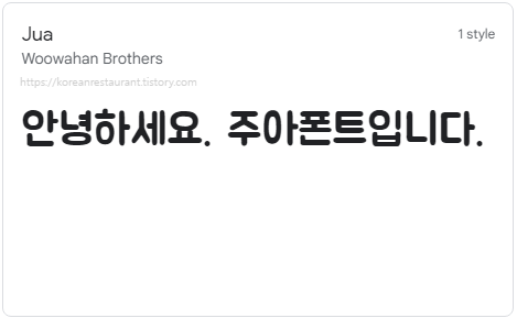
Jua 주아
One of hot fonts released by Woowahan Brothers. Thick and clear, friendly from brush-written-like touches make this versatile. Personally I used this font for mobile & web design stuffs. All digital design stuffs such as instagram carousel images sound good to go with this. However, I guess this isn't a body text style. You can google “주아 폰트” to see design examples.
STYLISH
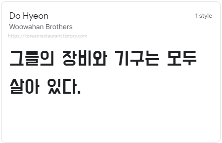
Do Hyeon 도현
One of another hot fonts released by Woowahan Brothers. A main font set used in popular food delivery app Baedalui Minjok(배달의 민족). Thanks to thick stroke, Do Hyun font is good for titling.
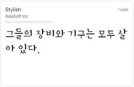
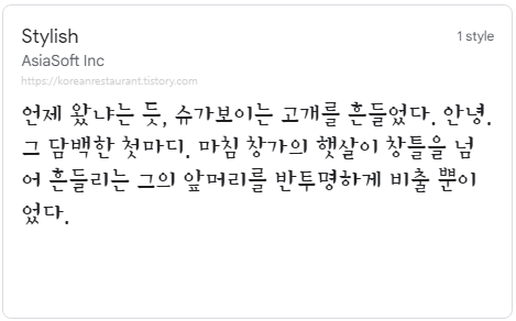
Stylish
Serif style font with a bit of styling.
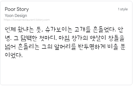
Poor Story
Well organized design font. Intentionally presented poor handwriting feeling is its charm.

FINISHING
I wrote to help foreign friends to select Korean fonts as a native Korean designer. However, this font collection is made subjectively. Also, these are from a limited source - Google Fonts - to begine with lightly. If font research is more in need, I would publish one more article about it. By the way, apart from my ideas, your own font choice would work better always because you know what you want exactly.

Bye Bye~
'Korea Talk' 카테고리의 다른 글
| Correct Way of Using Korea Electric Bidet (0) | 2022.04.08 |
|---|---|
| 10000 Korean money value? Exchange rate & Starbucks price (0) | 2022.04.07 |
| S Korea Quarantine Exemption Applications for Vaccinated People Resumed (0) | 2022.03.21 |
| S. Korea Quarantine Rules for Foreigners - From 4 Feb, 2022 (0) | 2022.02.02 |
| South Korea Quarantine Rules For Foreigners - Up to date (0) | 2022.01.02 |


댓글